An architecture student chose me as their subject for an architecture school report. She did a pretty good job.
Cristina Dumitru
May 18, 2019
Architect Interview – Mark A Silva
Mark Silva is the sole designer/ owner/ employee of 505architecture, previously known as Silva Studios Architecture. The company was comprised of three other individuals in recent times but as each person left eventually, Silva decided against finding replacements. It was unusual for him to have these employees in the first place, as he was on his own for the first 29 years of his practice and appeared to become accustomed to working solo without distraction. He is responsible for all aspects of his business, from the most mundane tasks to the design, which is his favorite part of being an architect. Marketing his business appears to be a forte; he has been posting pictures of his work since the Internet was introduced. As projects were added to his portfolio, he removed images of work from his website that he no longer wanted to be representative and thus developed his strategy for attracting clients. He has a strong online presence, updates his blog frequently and can be found on various professional social media websites. From an early age, prior to his teens, Silva was interested in art and design, later wanting to learn how buildings are put together. Frank Lloyd Wright is a primary inspiration and stylistic similarities can be seen in his work. At age 13, he read a book about the life and work of Wright and this was part of the catalyst for his desire to become an architect.
Silva pursued the route of obtaining his license through work experience only, which is mostly unheard of, particularly today. He is proud of this fact; he says he was paid consistently throughout this time while learning instead of spending money on tuition. His first job at an architecture firm was for Sillman Wyman & Associates, he continued on to work at Coulborn Currier Noll and Tucker Sadler Architects, all local businesses in San Diego. In 1994, he obtained his licensure. Silva is one of the most brilliant and innovative architects in San Diego. His critically acclaimed work has been featured on HGTV, Luxe Magazine, San Diego Home Garden Magazine, Riviera Magazine, Design Bureau Magazine and many others. Silva specializes in high-end luxury homes in a style that can best be describes as modernism as a whole, with a few projects containing post-modernist elements. He is an incredibly versatile individual; each project is a unique masterpiece. Although employed by mostly wealthy clients, it was made clear he did not pursue architecture for financial reasons because he mentioned this being something he learned about Wright’s story. Like all of the architects I have encountered, Silva stated that architecture is difficult. To him, it is the most difficult field to express oneself artistically due to jurisdictional regulations that are taking the fun out of his work.
Can Deus, named “House of the gods” by his clients when they saw the design, is a vacation home on Mount Soledad, in La Jolla, CA. The style of this residence can be described as post-modernism since it has some similarities to classical and modernism. Can Deus is featured on the cover of Luxe Magazine (July/August 2017) where it is described as “California bike and surf culture meeting London sophistication. “Although the front façade of the home is not as spectacular as the backyard, it stands out from the surrounding residences which appear dull in comparison to Can Deus. The cantilever and the use of natural colors makes it appear similar to FallingWater by Frank Lloyd Wright.
Can Deus’ backyard, we can see a 12-foot cantilever which is a metallic balcony with a glass railing oriented towards the best view from the property: the beach and the canyon. There is a concrete element in front of it that looks like a gate, but can also be used as a picture frame that the architect created to entice us to look through or walk through the areas of the backyard that he wanted us drawn to. There were light colors chosen to make the atmosphere appear lighter instead of heavy. Although there are ample windows, as we would see in modernism, there are overhangs shading the windows. This has a sustainability element to it; the sun will only enter during the winter when lower and during the summer shade will appear.
There is no visible barrier from the terrace to the canyon below it and it is thought of this way so that there isn’t a barrier between nature and the individual which would prevent them from enjoying the view. Throughout this project, we will see that the architect has thought of the surrounding nature.
There is symmetry and rhythm to the lights the architect placed throughout the residence, reminiscent of classical Greek ideas. We see an important vertical element which is the focal point of the space. My interpretation of this element, the fireplace, is that it represents fire and life because of the color used.
In the kitchen, we see some metallic materials which is different from the natural feel of the rest of the house. I believe this is because the kitchen is a technological and utilitarian area of the home and the architect distinguished it as such in this way. The lights have the same color as the vertical element so that there is consistency of the same colors reflected throughout the space.
Whalen is a mid-century renovation of a 6,000 square foot concrete house in Pacific Beach on the beach at Mission Bay. The architect encountered some difficulties with this home, particularly the size of the backyard. The clients wanted it to be used for charity events which could hold 100 individuals and at the same time have a large pool for the kids. I believe the function of the white columns is both aesthetic and to create shade or help with rainfall. They are perfectly centered with the façade so they add rhythm and character to it. The addition of the white makes it more authentic and interesting. The doors open asymmetrically in the middle, while this is beautiful, it could lead to rainfall inside the house if not for the white columns. While this home has some organic art inside, I assume to match the atmosphere of the location by water, it is overall classified as modernism.
On one image we can see the side of the house, which has a water element that correlates to the beach. It is a 100 ft pond that one walks across and makes the best use of the space by combining water and greenery, creating an inviting path.
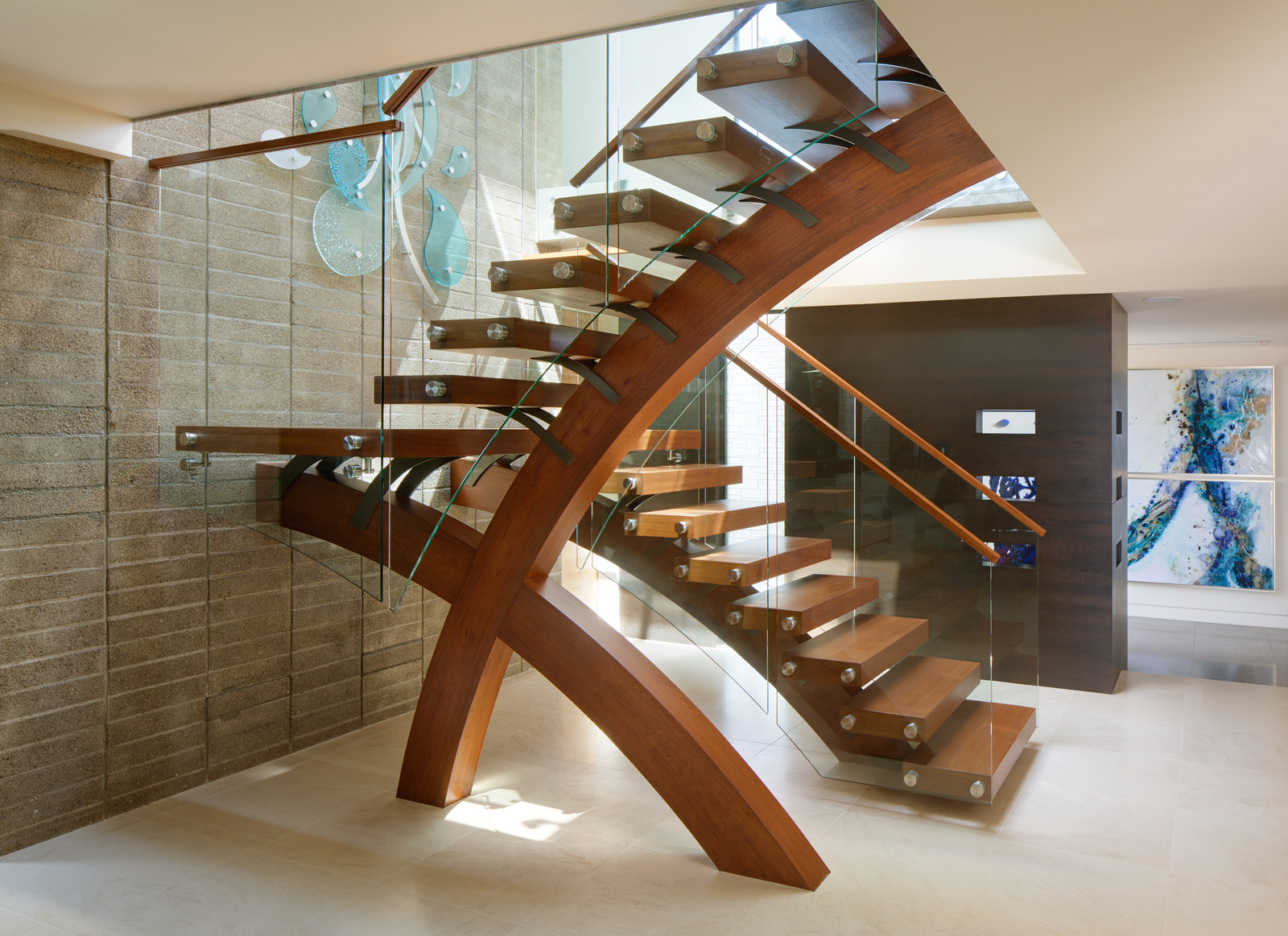
The client desired a curved stair but there was not enough room for it so he solved this by putting a curve in elevation. The stair is striking and has even won an award. While round stairs are aesthetically pleasing, they are uncomfortable so he managed to make a stair that both works and is rounded.
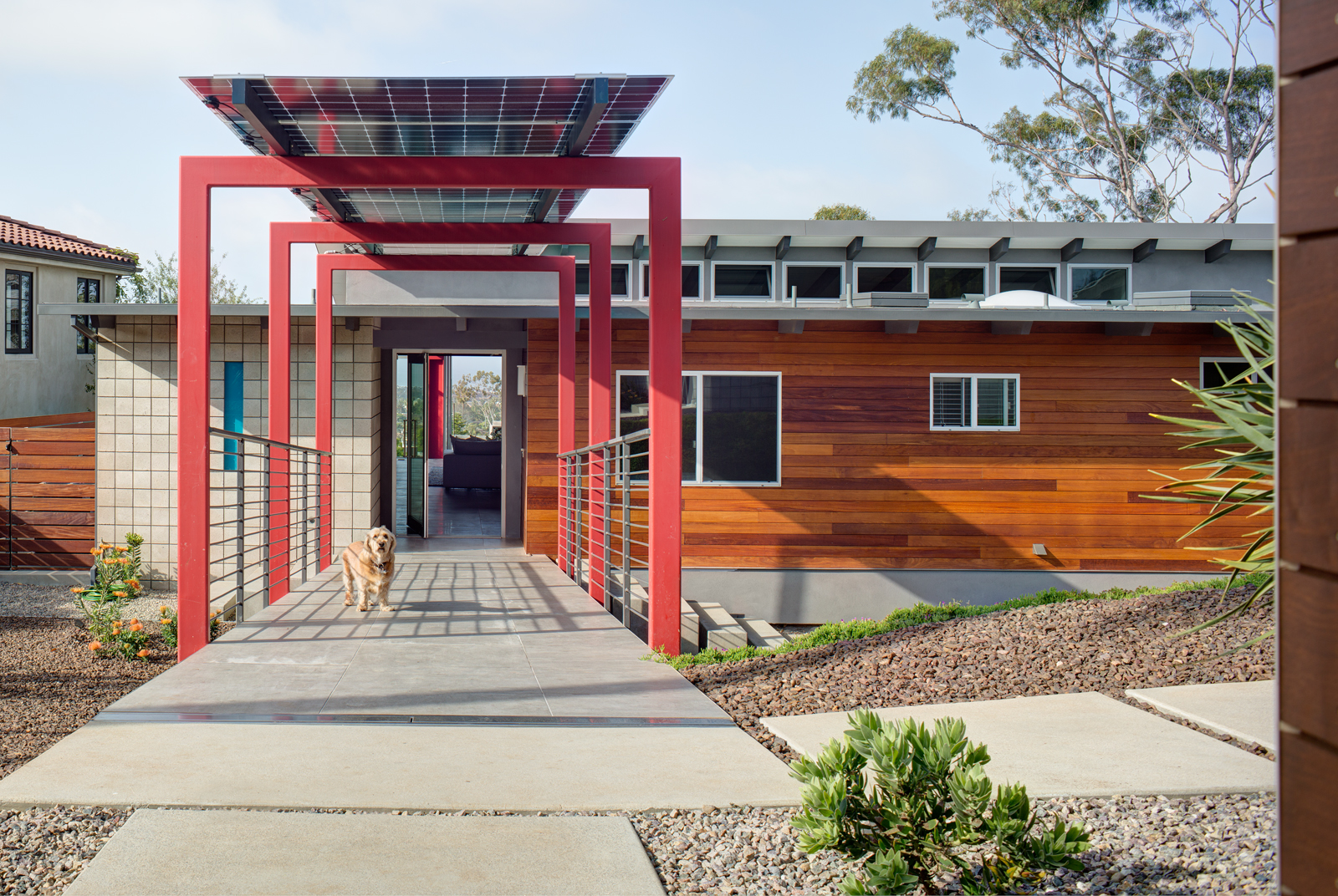
Windsor Tree House is a home in Pacific Beach, CA, designed in modernist style, and named after a magnificent eucalyptus tree on the property. He used red, a strong color, for the front gate and again for a pathway at the front of the house so that it stands out to the visitor. For this project, he left nature as it is and used the bare minimum for walking areas. It was thought out so as to not disrupt the surroundings.
We see similarities to Can Deus with the red “portal” he used to distinguish the pathway and also to place solar panels on top to protect from rain or add shade. It is very difficult for an architect to use solar panels and make them fit so seamlessly within the project as though it is meant to be there. We can see many windows of different sizes and a small blue window as well in the concrete block. I believe he used the red for the door and the pathway, so that like Can Deus, you will see these same colors reflected throughout the project. His projects, while creative and abstract in some ways, contain consistency and cohesiveness.
The best room in this entire residence is the bedroom, where you can see the eucalyptus tree. There is a rhythm to the windows, they become larger and larger to create a beautiful view. The windows also add some dimension and are made in such a way to leave the impression that you are outside. The architect looked at the topography surrounding the house and decided to make this the best view in the entire home. This was done purposely, as he wanted his clients to feel as though they were sleeping in the tree, and they do.


